Showing top 0 results 0 results found
Showing top 0 results 0 results found

Buttons are simple, clickable elements that a bot may send to users to showcase different options. If created well, they can significantly improve the user experience. However, if implemented carelessly, they can really stir things up. What to pay attention to while creating your chatbot buttons, then? Read the post and find out!
Describing Mac OS X’s Acqua user interface, Jobs said: “We made the buttons on the screen look so good you'll want to lick them.”
Indeed, Apple designed good buttons. But most importantly, the brand proved that even small and seemingly insignificant elements can add great value to the user interface.
The same concerns buttons in a chatbot. They help to attract users by imitating real objects. We are used to pressing various buttons in everyday life while using telephones, cookers, or remote controls. Touching buttons is almost reflexive (have you ever tried not to push the bubble wrap?). So by applying them, you can ‘lure’ users and engage them in a conversation with a chatbot.
But what exactly are chatbot buttons, and why and how could we use them?
🤖 Would you like to improve your customer engagement?
Buttons for newbies
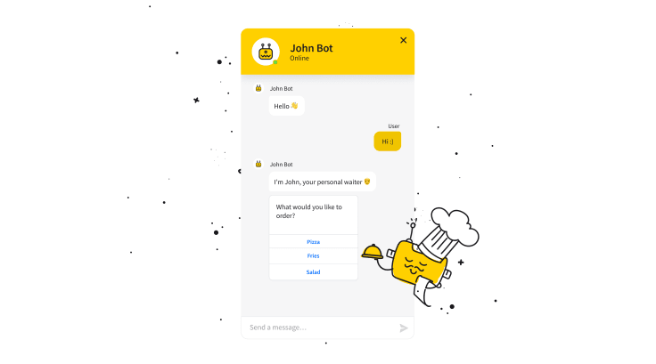
Buttons are clickable elements that a bot can send to a person on chat. Their significant advantage is letting chat visitors specify their needs without formulating them. People who see a button can choose the information they need or are interested in without even typing a word in the chat widget. It’s convenient, especially for mobile users, whose number is forecast to reach 4.68 billion in 2019.
What’s more, most of us also tend to use multiple apps simultaneously. We’re masters of multitasking, but we are still easily distracted by emails, SMS notifications, or other reminders. And well, I’m not sure whether it will ever change.
That’s why buttons are a good solution for chatbot makers, as they help bots to sustain a conversation.
After clicking, a button can trigger various actions: open new pages, let a person jump to a different part of the chatbot story, allow one to choose one option from a menu, or dial a phone number. The interaction between a bot and a person is also more dynamic.
It's worth adding that buttons narrow down the conversations, as they allow creators to control the narrative. Nevertheless, they have a very good influence on the shape of a conversation. Natural language processing which enables chatbots to run free question conversations is improving, but it’s still not foolproof, and users get irritated when it fails.
Whereas buttons are controllable and help master chatbot scenarios, avoiding communication misunderstandings and failed transactions.
I hope I have convinced you that chatbot buttons are worth using. But is there anything you should pay attention to or avoid while creating your buttons?
Of course!
1. The length of the copy
Mark Goldstein, the author of the book “Just Listen” writes that you can get through to absolutely anybody if you listen to what they are saying. It's not rocket science that we prefer to build relationships with people who listen to us and don’t talk our ears off.
But maybe it’s not so obvious that this rule also concerns human & chatbot relationships.
Whether your chat visitors talk with a customer service agent or a bot, they will be happier if they don’t have to read the wall of text to understand what you want from them. Communication happens when speakers exchange sentences, not monologues.
Besides, buttons limit the user input to a sufficient degree. Therefore, try to make your copy short enough so that a person doesn’t feel it so much.
What’s more, the aim of your bot responses is to support navigation and help users achieve their goals. Whether it’s getting FAQ information, links to products, or setting up an appointment, people will appreciate a brief process. You can limit the number of characters on your buttons to 20 signs. It will make your bots more “conversational” and let visitors feel they are talkers, not listeners.
2. The copy which lacks the context
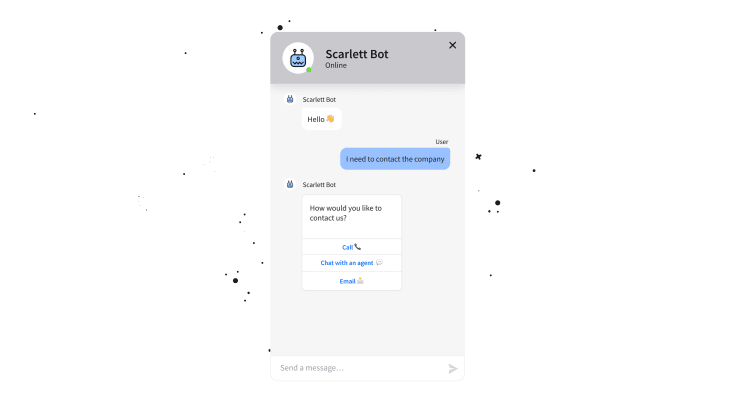
Here’s the typical chatbot scenario. A person comes to chat, and they are welcomed by a bot. The chatbot asks a question and lets users answer it using the “yes” and “no” buttons.
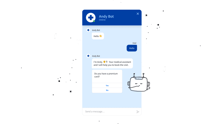
At first glance, the use of buttons seems right. We ask a question and provide users with a choice. However, I would avoid using “yes” or “no” responses.
The point is that modern users don’t read the text thoroughly; they tend to skim it. If you additionally put some buttons, cards, or visuals into this text, they will immediately focus their eyes on the element that marks out, not the text. If you use only “yes” and “no” on your buttons, some users might not know what the words refer to. In effect, they will have to go back and read the question.
The solution?
Try using more contextual buttons instead.
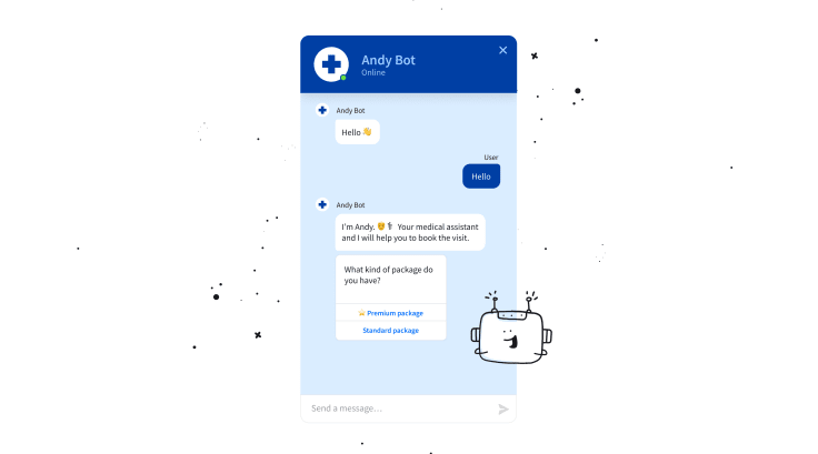
It may seem nonsignificant, but the context will help customers immediately find out what they can expect after clicking a button. This will improve the flow and help visitors reach the finishing post faster.
3. Chatbot language & personality
Creating a clear, brief, and informative copy on your buttons is a must.
But you can do much better.
Your chatbot can be more than just a machine answering simple questions. It can be your brand ambassador that has a personality matching your brand.
Researchers state that customers can make as strong relationships with brands as they have with their friends or families. So if we treat a chatbot as a part of your brand, we can assume that customers can also build relationships with it.
Think about your chatbot holistically and make sure that even the shortest bit of text and its images go perfectly with your brand image.
The only thing I’m against while creating your chatbot personality is using sophisticated words and too ambiguous phrases. Simply speaking, making your chatbot too cool to be cool.
Sometimes seemingly funny or interesting phrases can be found confusing or cheesy by others. I don’t mean you should totally avoid using creative texts. Just make sure your bot and customers are on the same wavelengths.
4. Users don’t know what will happen after clicking
Imagine you’re in a hotel in a foreign country. You are standing in a corridor with 5 doors. All of them have some writing, but unfortunately, you have no idea what they mean.
Now imagine the same situation, but let’s assume that apart from writing, all door cards also have simple images. Immediately, you can say which door opens the ladies’ bathroom, which goes into the stairs, and which opens the broom closet.
In some cases, images work better than words.
The same concerns your buttons. The text is important, but images or emojis could be a great UI help. They could support understanding and engage users.
When appropriate, you can add a clear emoji that will show a user what will happen after clicking. You can also replace some words with them, or maybe sometimes, using an emoji would be enough.
Rely on your common sense while using icons and choose those with a universal meaning.
And remember not to go wild with using too many of them. Even the most delicious chocolate can be harmful if it’s consumed too often or mixed with the wrong dishes.
5. The number of options
Customers like to have a choice while shopping. However, offering people too many options could also negatively influence their experience.
Although buttons provide a set of options, they work best when users have to choose from a small number of them.
It’s like going to a restaurant that offers a menu with hundreds of dishes. It’s hard to decide what you want if you see over thirty kinds of soups. But if you see 3 or 5 desserts, the decision seems to be much easier.
Therefore it would be helpful to use up to 5 buttons. By giving users a limited set of options, you actually help them make quick decisions, avoid overthinking and settle their matters faster.
6. The “Menu” button.
You can create engaging scenarios; however, there is always a risk a customer changes their mind about the decisions they made a couple of steps before.
That’s why, while constructing your chatbot scenario, don’t forget the “Menu” or ‘Skip to” buttons. Think about where you should place them so customers can seamlessly go back to previous stages and change their decision without struggling too much. Being able to start from scratch easily is always a good option.
7. Your buttons just don’t fit
At last, check whether the types and the number of buttons you used are adjusted to the platform you integrated your chatbot with.
Almost 90% of Messenger users access the app using mobile devices. Therefore, Messenger is a perfect place for buttons. Its users find it much easier if they just need to click to get specific information or complete certain actions.
However, using buttons is not necessary for every platform. That’s why I advise checking what kind of users visits your chatbot platform (mobile/desktop) and what type of communication works best there. Maybe your users prefer writing to clicking?
To click or not to click?
You already know what buttons are, what mistakes you should avoid while creating them, and what tricks you can apply to make the most of them.
However, the success of your buttons depends also on your creativity. Spend time creating them, experiment with copy or images, and observe how users interact with them. Check whether your buttons help the conversation. Maybe there is something else you could do to improve the button experience, but I haven’t mentioned it in the post?
And don’t worry if users won’t lick your buttons. It will be good enough if they just love to click them.
🤖 Would you like to improve your customer engagement?


